For years we had the secret desire to work with experts in the field of colour to bring a new twist to our famous crumpled cup, for the public, architects and interior designers. Yet little did we imagine how enriching our 2021 collaboration with the paint brand Ressource would be, or how strong the decorative result would be.
Ressource and Revol have several things in common: French manufacturers in the same families for several generations, based in the South of France, they both hold the EPV (Entreprise du Patrimoine Vivant) heritage label and have creativity in their very DNA.
We started by thinking about our respective trades, with the aim of bringing together our skills through the connecting thread of colour.
« Colour is the glue of interior design, linking different objects. A cup placed on a pretty table against the backdrop of a beautifully coloured wall. Elements talk to one another and create a room’s harmony.»
Annabelle Vermont, Artistic Director at Ressource
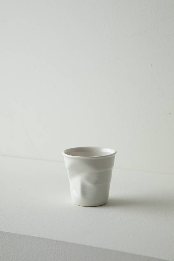
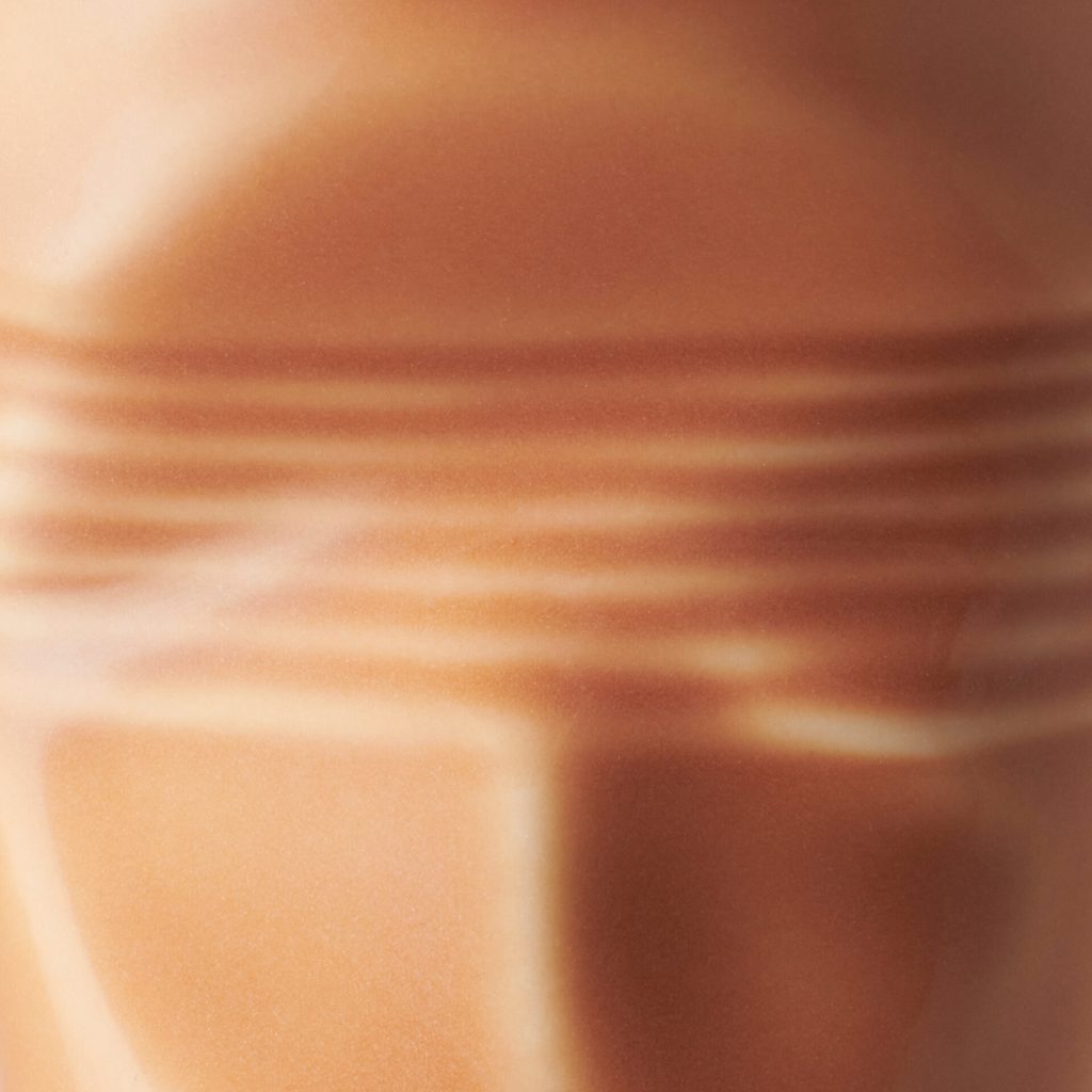
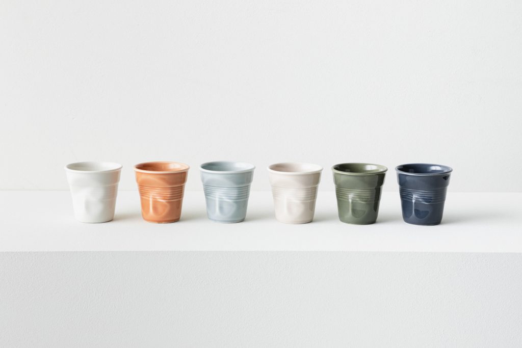
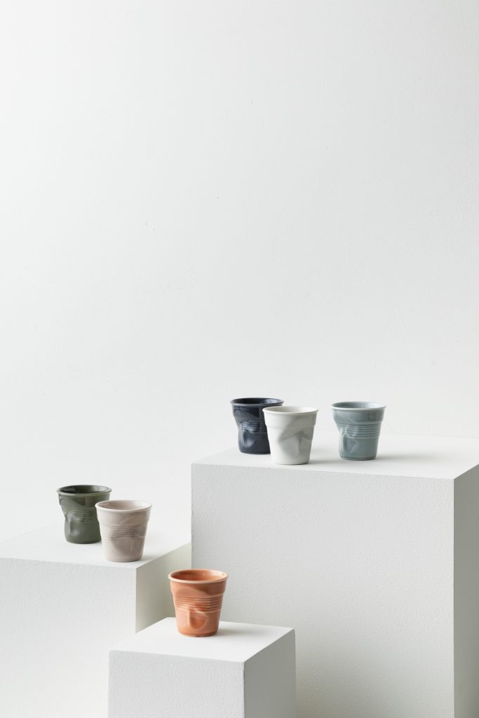
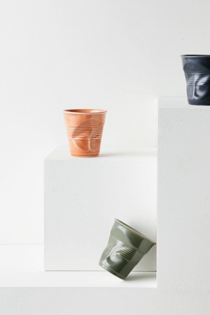
The Froissé cup stands out for its unique shape. The imprint of a hand makes a living, sculptural object. Making colour work on an object with strong, complex reliefs was part of the process from the very start. We had to find colours that work with the shape in order to bring it out. So Annabelle Vermont, Ressource’s artistic director, created a palette echoing the simplicity and purity of nature.
After many tests and discussions in the Revol laboratory to obtain colours as rich, varied, subtle and nuanced as those suggested by Ressource, the new range saw the light of day.
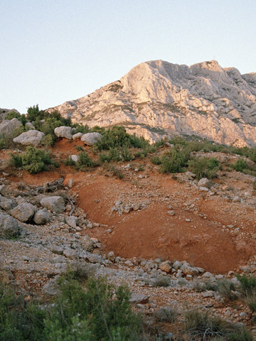
Created exclusively for Revol, the range was conceived as a walk through the natural world of the South of France. The colours are inspired by simple, elemental nature with its many materials: water, sky, earth, plants, rocks… Created as semi-tones, the colours seem to oscillate between different shades. They interact with the light. Shadows play in the folds and hollows, create nuances and reliefs of colour. The effect is inherently tasteful because the colours work well both together and alone.
@myprovence.fr
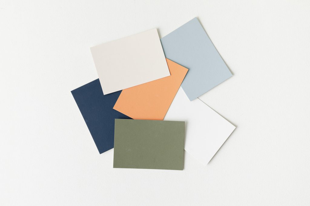
The range was conceived in response to different tastes and decorative styles. Whether on a kitchen counter, on a tablecloth in a restaurant, on a fireside coffee table, on the edge of a desk or on a shady outside table, this is a range that has been thought out to allow for all sorts of possibilities.
Hence, it’s a measured, balanced range with warm, cool, light, strong, sober and bright colours.
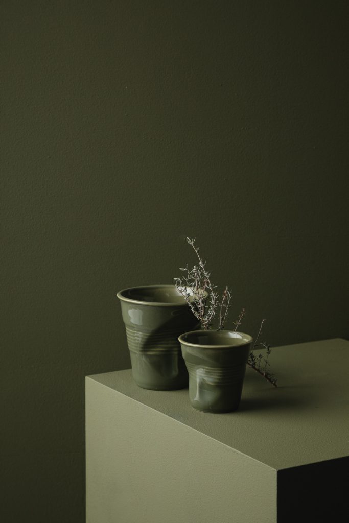
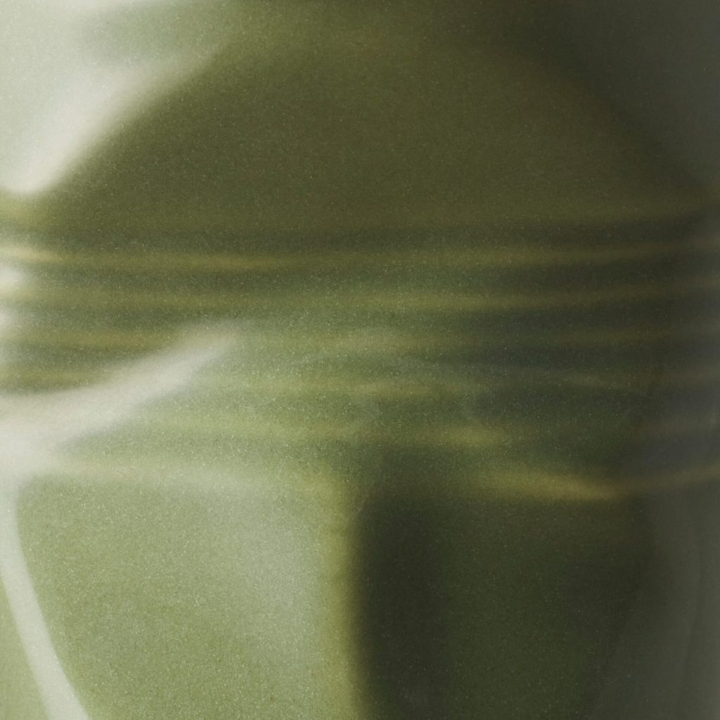
GREEN GARRIGUE :
A khaki with a hint of bronze – quite strong without being too dark. A compelling colour, rooted in the nature of the South of France where plants are bathed in sunshine and exposed to the wind, releasing their scent when they come into contact with stone. A hint of magenta softens it, and the sun shows through in its yellow tinge. It’s strong colour conveying nature with all its aromatics, with its herbs to leave out to dry – a sophisticated, chic colour for strong decor.
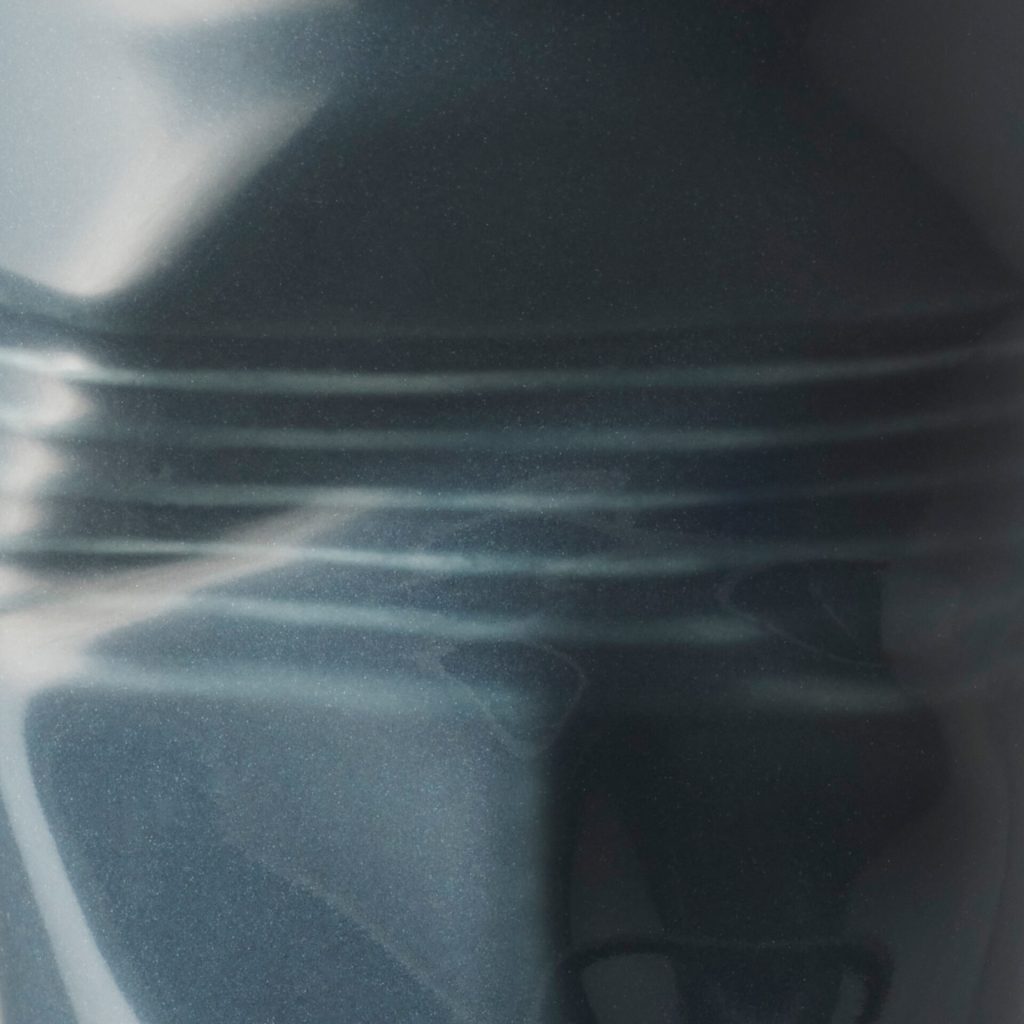
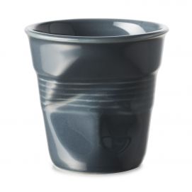
GRAPHITE :
A very dark grey bordering on black. A hint of magenta lights its up and enlivens it – this is what stops it being black. It’s a colour that makes you want to touch it to understand it and experience it more fully. Neither grey, nor black, nor blue, it is the very essence of a dark colour that one can’t classify. It simply exists. It’s a colour reminiscent of intensely matte raw volcanic rocks forged by fire, and of slate. It’s a characterful, bold colour; a neutral colour for low-key urban decor and celebrations.
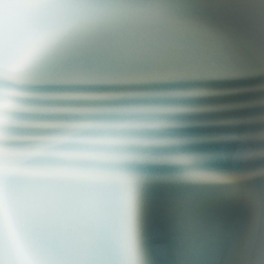
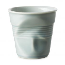
BLUE MISTRAL :
A blue enamoured of green, slightly toned down to create a gentle, precious colour. A hint of yellow gives it luminosity. It’s inspired by the blue skies of Provence, where the clouds have been swept away by the mistral and made way for a pure, intense expanse of blue. A velvety, pleasing colour. An accessible colour suited to luminous, gentle, contemporary decor.
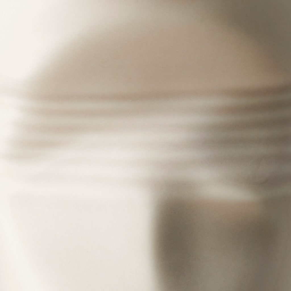
GREY PEBBLE :
A light, neutral, warm beige enlivened by pink, yellow and brown for an icing-sugar hue. This colour puts one in mind of the the pebbles of the Rhône Valley but also of walking barefoot on the beach. Mineral, it is easily tamed. It’s a colour both classic and contemporary for low-key, discreetly elegant decor.
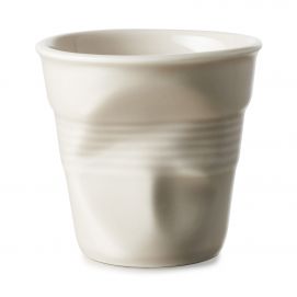
SHELL WHITE :
A subtle, nuanced white with a very subtle hint of yellow and brown to bring it a touch of warmth. This off-white is dear to Ressource, who believe that a well-chosen white is the keystone to successful decor. It goes well with the other colours because it has a small concentration of pigments that link it naturally to the rest of the range. It’s inspired by the small snail shells of Provence, the shells on Mediterranean beaches and delicate eggshells. It’s light as a breath. Neutral and low-key, its elegance makes it at home anywhere and in all types of interior.
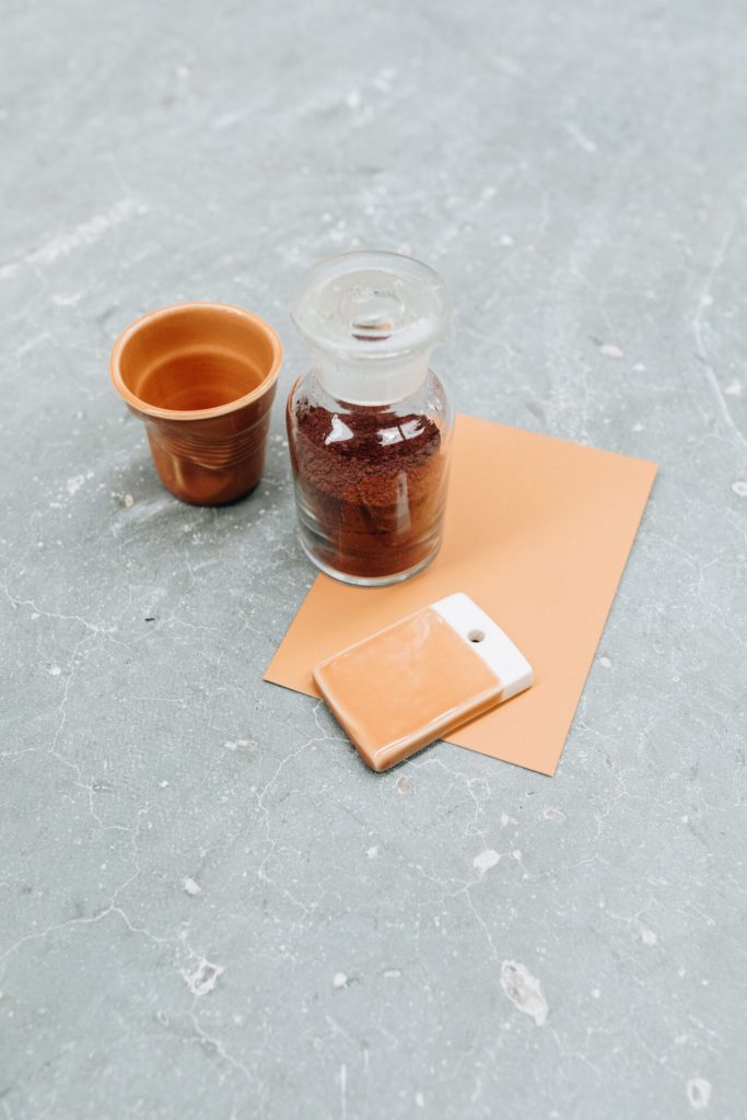
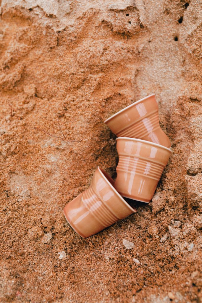
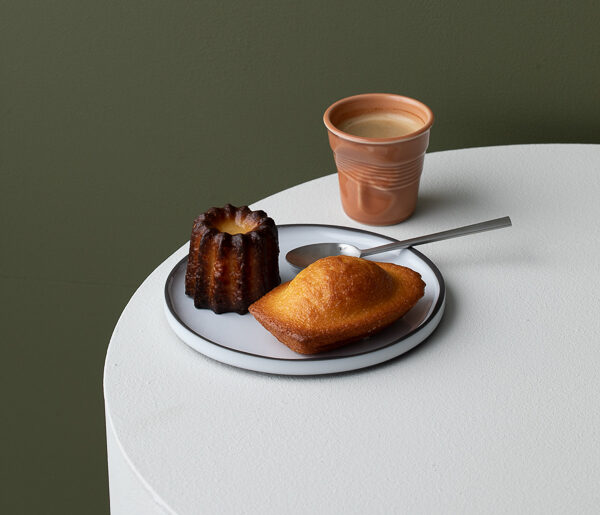
SIENNA EARTH :
A warm colour inspired by the ochres of Provence, this soft, slightly earthy orange reminds us of Provençal culture with its Italian inspiration. Fired earth, potteries and craftsmanship have inspired this well-rounded, sunny colour. It’s a bright but delicate hue that can both make itself known and blend in, ideal for interiors filled with crafts and natural materials.
We use cookies on our website to give you the most relevant experience by remembering your preferences and repeat visits. By clicking “Accept All”, you consent to the use of ALL the cookies. However, you may visit "Cookie Settings" to provide a controlled consent.
This website uses cookies to improve your experience while you navigate through the website. Out of these, the cookies that are categorized as necessary are stored on your browser as they are essential for the working of basic functionalities of the website. We also use third-party cookies that help us analyze and understand how you use this website. These cookies will be stored in your browser only with your consent. You also have the option to opt-out of these cookies. But opting out of some of these cookies may affect your browsing experience.